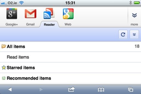
Google Reader on iPhone. A last bastion of how things used to be.
As much as I’m a longstanding fan of Apple’s software and hardware, I have to admit that Google has been playing a large part in my technological life for an long time. Gmail was ridiculously useful when it first emerged and has remained so, and Google Maps was repeatedly helpful during my global travels. However, the biggest Google product in my life has long been one of the company’s lesser known lights: its online RSS reader service, Google Reader. For at least the last few years, it’s been a quick and easy way for me to keep up with numerous news sources that might have taken me hours to trawl through if I’d visited each web site independently.
Not too long ago, Google announced that they were going to update Google Reader to bring it into orbit around the company’s new star product, Google+, integrating it with the new social hub and altering its UI to make it part of the new Google “look”. I didn’t pay too much attention at the time – I had already signed up to Google+ and figured that Google would make the transition pretty painless for existing users. Well, the change went through a few days ago, and some people aren’t happy.
The least of the problems is the UI, which is part of Google’s drive for visual consistency across its products. Such things are to some degree a matter of taste, and while the new design looks polished and professional, it also seems a bit flat, with elements seeming to hang in space, unconnected to anything around them. Adding to the problem is the fact that the sidebar and header take up an unnecessary amount of space, leaving less room for the primary purpose of the service, which is reading articles. (I’ll give Google a pass on the fact that the new UI seems to slow down rendering of the page, as my four-year-old laptop is showing its age, but if I’m having problems there, others probably are as well.)
More problematic for me is the mutilation of the feature that kept me with Google Reader over the years: the ability to share articles with my Reader-using friends. The new method for sharing works through Google+ and requires you to publicly “+1” an article first. You can bypass the “+1” requirement by clicking the “share” button in the universal Google control bar at the top right of the screen, but it’s not an intuitive leap to connect that button to a free-floating article elsewhere on the page. As for people who use Reader but not Google+? It seems that I’ve been disconnected from them on a permanent basis, unless they feel like signing up.
On my part, it’s a lesson about not relying too much on one company to support your online habits on an ongoing basis. As an Apple user, I should be well versed in the notion that a company has no obligation to continue supporting a product or service that offers it no profit. After all, Reader is small beans for Google. However, for Google, the reaction from Reader’s users should be a reminder that the product from which it makes most of its money is its users (Android is making more money for Microsoft right now). Driving those users to accept a new world order based around Google+ and a new UI seemingly designed without due care and attention (something Apple users have been getting used to from Google lately) is likely to lose it users, at least in the short term. This is the internet, where there’s always another option.
For the moment, I have no intention of jumping ship from Gmail. I’ve changed email addresses before and will do so again, but for now I can use Gmail on my phone and laptop without ever going near the Web interface. I may, in my drift away from Facebook, someday use Google+ more actively. What I am doing though, is looking for a useful, speedy alternative to Google Reader. If any of you have RSS feed readers that you particularly like, I’m open to suggestions.
Discover more from cerandor.com
Subscribe to get the latest posts sent to your email.
Ooh – I’d not realized the Share function at the top worked that way. The public +1 was annoying me. I don’t necessarily want a public record of my prodigious sharing. 🙂
Other than that – while I was annoyed that the native Reader Share got nerfed, I was also annoyed that it didn’t give an option to share on G+. The optimal option would have been to keep Share separate from +1 and give the option to share to Reader followers and/or G+.
UI wise – I’d just got used to the next and previous buttons being at the bottom of the screen so their change anoyed me most.
I only found out about that element of the Share button by reading the article I linked to (and the author of that had to be told by a commenter). I figured it was worth sharing. I don’t mind learning a new UI every so often, but there are some elements that clearly weren’t thought out here.
BTW – you’ve probably noticed that I’ve reconstituted some of my old sharing functionality in a G+ circle. The Shares must flow!
Lifehacker surveyed their readers for alternatives, this is the results article:
http://lifehacker.com/hive-five-followup/