Category Archives: Technology

A History of Laptops

20120730-114012.jpg
A laptop sandwich: From bottom left, iBook, MacBook, MacBook Air.

To date, I have owned four Mac laptops, more or less. The first, back in my college days, was a Powerbook 145, which came with a black-and-white screen, a floppy drive and 2MB of RAM. From the privileged vantage point of the present day, it would seem unbearably clunky, heavy and underpowered, but at the time it was a revelation. I’d been using Macs for a few years, but to own one that I could throw into a bag and carry over one shoulder? Genius. (Mind you, my un-ergonomic habits with this laptop probably contributed significantly to a tendency to stoop and lean to one side that persisted for years.)

The one major drawback of the 145 was one that plagued most laptops of the time and would continue to do so for years: reliability. It didn’t last me more than a few years before it broke down to the point where repairing cost as much as replacement. Since I didn’t have the coin to do either, I passed out of the realm of Mac laptop-dom for several years, reverting to a desktop iMac when I finally got a job and could afford a machine of my own.

When I finally got my hands on a Mac laptop again, about ten years ago, it was in the form of a 12-inch white iBook. (The bottom layer of the laptop sandwich above.) With a PowerPC G3 CPU, an unheard of 128MB of RAM and a combo CD/DVD drive, it was a major step up in every way. The 12-inch form factor made it all the more appealing, as it was far easier to carry than the by-then lost in the mists of time 145. It was a lot more robust too, and it suffered its fair share of battering as it accompanied me for several years. However, it had one fatal flaw: a logic board issue that broke the connection between the computer and its screen. As before, the cost of repair rose too high, and the iBook was banished to a cupboard as I returned to the world of the desktop.

Five years ago, I took another shot at the Mac laptop scene, this time in the form of a 13-inch polycarbonate MacBook. (The middle machine above.) Like the iBook, it was white and plastic, but it raised the solidity factor a few notches, and despite the fact that it had a larger, 13-inch screen, it felt sleeker and lighter to carry. Despite the plastic shell’s tendency to fray at the edges (and the fact that the first iteration of this laptop was stolen by an absconding flatmate when only a couple of months old), it was by a long distance the most robust laptop I’d ever used. In five years, the only problems it suffered were a few hard drive glitches that eventually ironed themselves out.

However, five years is a long time in computing, and the MacBook has been struggling with newer software for a while. So the time came last month to put it out to pasture and move on. Where to? To a MacBook Air, leaving behind the world of polycarbonate in favour of an aluminium unibody. This leap shouldn’t be understated. The screen is a mere 11 inches yet bright and pin-sharp, and the laptop itself is so thin and light that the first time it was in my shoulder bag, I had to resist the urge to check whether it was there.

For all that, it feels amazingly robust. For someone who is used to thinking of computers as circuit boards wrapped in a plastic shell, this feels like a solid lump of computing ability. Apple gets a lot of grief for making machines that users are never supposed to delve into or alter, but the tradeoff is clear: this has been engineered to within an inch of its life, and picking out a flaw is very hard to do. The leading edges are so thin that the thought of attaching the Air to an axe-haft and using it to split wood isn’t completely ridiculous. The sound that the lid makes when it closes is redolent of solidity in much the same way as the sound of a high-end car door closing.

No doubt I’m still in the afterglow of an encounter with the new shiny. It’s happened before. There may yet be flaws that time will reveal. At the moment, all that occurs to me is the fact that my hands are a little large and come into contact with those sharp case edges when I type a little too often. A case may be needed, but for once it’ll be for my protection more than it will be for the machine’s.

My kingdom for a laptop, but which one?

20120619-113434.jpg
The Retina Laptop: shiny takes a quantum leap.

So Apple revealed the long-awaited upgrades to their laptop line at their WWDC last week. As someone who’s been using their products for years, and for whom a new laptop is rapidly becoming more of a necessity than an option, I was keen to see what they might provide. And amidst all the glitz and sheen, I got plenty of information on what my next laptop might be, but also the one after that.

I’ve had my eye on the MacBook Air ever since its first revision made it a compelling option rather than an overpriced status symbol. The 11-inch version is eminently portable, and all it seems to lack over its 13-inch brother are an SD-card slot, a slightly faster processor, and better battery life. All things that are desirable but not must-haves. The new MacBook Airs are faster than before, now come with USB 3.0 ports and improved video cameras and are just as sleek as ever.

However, the MacBook Pros also got their due upgrades, also with faster processors. Shiny and sleek though they may be, they lack something in the portability department when compared with the MacBook Airs, but make up for it in terms of connectivity and storage. Hard drives are still streets ahead of solid-state storage in terms of capacity. The 15-inch Pro is out of my price range, but the 13-inch would be a very fitting replacement for my 5-year-old MacBook.

And just to delve into the future, Apple’s 15-inch MacBook Pro with Retina Display is a sleek replacement for the 17-inch MacBook Pro as an Apple status symbol, ditching the DVD drive in favour of wireless connectivity and a gorgeous screen. It is, undoubtedly, the future of Apple’s laptop line, in the same way as the MacBook Airs were when they arrived. A few years down the line, this is the path that Apple and the rest of the industry are going to follow. However, if its non-Retina 15-inch brother is out of my price range, this slice of things to come isn’t every within view.

So which to go for? The 13-inch MacBook Pro seems the more professional option, with everything I might need to actually work on it and more screen real estate than my other preferred option, the 11-inch Air. Except that their screens are pretty much equal in terms of resolution, and the Air is far more convenient to carry around. Add a DVI connector to the purchase so I can use an external monitor and even that advantage slides away, leaving only speed and storage. Speed isn’t something I need to worry about much – I don’t play games on my laptop, and both machines use the same Intel graphics anyway. As for storage, I’ve been coping with a 130GB hard drive on my old laptop for years. A 256GB solid state drive would be a massive leap in terms of both capacity and speed.

So I guess I’m opting for the 11-inch Air, tempted though I was by other options. Dock it at home for professional work and take it on the move for whatever else I might use it for (including work). All the while, I’ll be casting eyes at the Retina display and dreaming of future machines…

Apple Gets Hyper Over Education

And you can play games on it too. That will be good for learning, I'm sure.
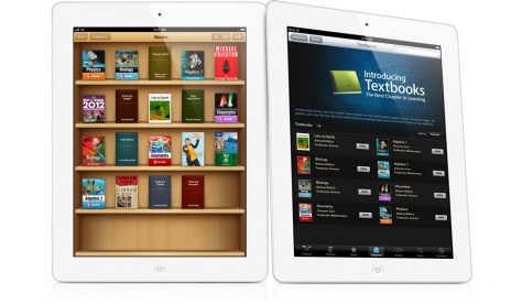
Apple's iPad has just got a big push into the education sphere

This afternoon saw Apple’s latest media event taking place in an unusual venue for the company – New York – and without the oversight of the company’s late founder, Steve Jobs. The focus of the event was education, a subject that Jobs claimed was close to his heart, and although the event was very much U.S.-centric, the announcements made there have much wider implications.

There are three main prongs to Apple’s education push: The first part is an upgrade to the iBooks application for the company’s iPad device in order to enable it to deliver media-rich, interactive text books for students in the U.S., focusing first on the high school level. The aim is to provide cheaper (assuming you factor in the cost of the iPad itself), more engaging, more up-to-date text books for students. That Apple has managed to get some of the main textbook providers on board already is undoubtedly due to the fact that if the technology company succeeds in turning the textbook market electronic, it will simultaneously kill the market in second-hand textbooks.

Prong number two is the new iTunes U app. I’ve been using the iTunes University section of the iTunes Store for a while, as it has an amazing selection of free audio and video recordings of lecture series. The new app takes that idea to the next step, allowing educators to create and manage courses and deliver them to students. Together with the iBooks app, it’s nothing less than an effort to make tablet computers in general and the iPad in particular central to education in the U.S. And where the U.S. leads in this regard, the world is likely to follow.

However, for me – someone who isn’t involved directly in education at the moment – the most interesting element of the announcement was the third prong: the iBooks Author application for the Mac. Although the focus at the event was on using this application to create textbooks, it’s clear that there’s much more potential here: iBooks Author allows anyone to put together rich media books, using video, audio, pictures and 3D elements together with text in an easy drag and drop environment. I’ve already downloaded it and am tinkering with it now to check out its capabilities, but already it’s reminding me a lot of a storied application from Apple’s past: Hypercard.

If you don’t know what Hypercard is (and unless you used a Mac in the late ’80s, you probably don’t), you could take away a few elements of the above description of iBook Author and it would apply pretty well: Hypercard created stacks (read: ebooks) into which content creators could place audio, graphics and even video, linked together with a programming language that prefigured the HTML code of the World Wide Web. iBooks Author may not offer the same degree of interactivity and expandability, but the capability is definitely there, and the drag-and-drop creation is much easier. The ebooks sold through Apple’s iBook store may be called books, but they’re really standalone apps, designed to run on the iPad. They’ll deliver content first and foremost, but the manner in which they do so will be limited only by the imaginations of those who use the app itself.

Of course, this being a brand new program from Apple, some caution is warranted. It’s already been pointed out that the EULA attached to iBooks Author may be overreaching itself. Similarly, Apple’s applications and devices tend to really hit their stride only when they reach the 2.0 milestone. Compare the original iBooks app, a polished but underwhelming competitor to Amazon’s Kindle, with the new textbook delivery system it has become. iBooks Author has a limited number of templates at present, and it will be a while before its users get to grips with what it can do. Already, however, I’m impressed with what I can see and am looking forward to playing with it and seeing the results.

Hobbitual Liars

Opening the gates to Middle Earth: in your face!

Peter Jackson has just released the latest video blog on the making of The Hobbit, focusing on the technical nature of the filming, especially the 48fps digital shoot and the efforts to create a fully 3D cinematic experience. Fascinating stuff, and despite my suspicions of all things 3D in the cinema I took a look at it, continuing my ongoing efforts to spoil every possible nice surprise that the cinema is likely to offer me months, if not years, in advance.

However . . . there was a point in the video where my sceptical hackles were raised. Not because of the 3D itself, but because I was somewhere close to 100 percent sure that Jackson was having a laugh at the expense of his audience of desperate fans. Enlisted in this effort, if I’m right, were two of the most respected Tolkien artists, Alan Lee and John Howe. If you don’t want to be spoiled, jump ahead to 8:28 on the film above and take a look. They describe a rather . . . unique method of creating 3D conceptual art.

Now, as I say, I’m about 100 percent sure that this is a piss take. It’s presented in a straight-faced manner, and I haven’t seen anyone else calling it out as being ridiculous, but then straight-faced jokes are very much in Jackson’s repertoire. So can anyone tell me whether I’m just being overly suspicious here, or is Peter up to his old tricks again?

The Perils of Polish

20111103-153139.jpg
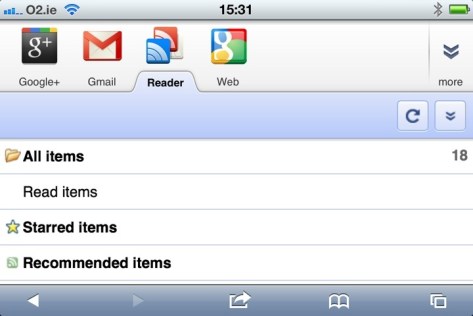
Google Reader on iPhone. A last bastion of how things used to be.

As much as I’m a longstanding fan of Apple’s software and hardware, I have to admit that Google has been playing a large part in my technological life for an long time. Gmail was ridiculously useful when it first emerged and has remained so, and Google Maps was repeatedly helpful during my global travels. However, the biggest Google product in my life has long been one of the company’s lesser known lights: its online RSS reader service, Google Reader. For at least the last few years, it’s been a quick and easy way for me to keep up with numerous news sources that might have taken me hours to trawl through if I’d visited each web site independently.

Not too long ago, Google announced that they were going to update Google Reader to bring it into orbit around the company’s new star product, Google+, integrating it with the new social hub and altering its UI to make it part of the new Google “look”. I didn’t pay too much attention at the time – I had already signed up to Google+ and figured that Google would make the transition pretty painless for existing users. Well, the change went through a few days ago, and some people aren’t happy.

The least of the problems is the UI, which is part of Google’s drive for visual consistency across its products. Such things are to some degree a matter of taste, and while the new design looks polished and professional, it also seems a bit flat, with elements seeming to hang in space, unconnected to anything around them. Adding to the problem is the fact that the sidebar and header take up an unnecessary amount of space, leaving less room for the primary purpose of the service, which is reading articles. (I’ll give Google a pass on the fact that the new UI seems to slow down rendering of the page, as my four-year-old laptop is showing its age, but if I’m having problems there, others probably are as well.)

More problematic for me is the mutilation of the feature that kept me with Google Reader over the years: the ability to share articles with my Reader-using friends. The new method for sharing works through Google+ and requires you to publicly “+1” an article first. You can bypass the “+1” requirement by clicking the “share” button in the universal Google control bar at the top right of the screen, but it’s not an intuitive leap to connect that button to a free-floating article elsewhere on the page. As for people who use Reader but not Google+? It seems that I’ve been disconnected from them on a permanent basis, unless they feel like signing up.

On my part, it’s a lesson about not relying too much on one company to support your online habits on an ongoing basis. As an Apple user, I should be well versed in the notion that a company has no obligation to continue supporting a product or service that offers it no profit. After all, Reader is small beans for Google. However, for Google, the reaction from Reader’s users should be a reminder that the product from which it makes most of its money is its users (Android is making more money for Microsoft right now). Driving those users to accept a new world order based around Google+ and a new UI seemingly designed without due care and attention (something Apple users have been getting used to from Google lately) is likely to lose it users, at least in the short term. This is the internet, where there’s always another option.

For the moment, I have no intention of jumping ship from Gmail. I’ve changed email addresses before and will do so again, but for now I can use Gmail on my phone and laptop without ever going near the Web interface. I may, in my drift away from Facebook, someday use Google+ more actively. What I am doing though, is looking for a useful, speedy alternative to Google Reader. If any of you have RSS feed readers that you particularly like, I’m open to suggestions.